Type Project
Data Visualization
Client
Data Visualization
Min read
Data Visualization
Data Visualization
Context-Story behind
My team asked me to solve this problem:
How can we visualise in a concrete way the amount of data we receive from our users?
Goal: Create a data dashboard that would allow us to visualise the data we needed and that could be updated efficiently over a long period of time.
See here the site with the final result
Challenge
About data visualisation. Before this project I had little knowledge about dashboards and how to visualise them. Although I have done some dashboards, I didn't do much research about the importance of visualising them and how to convey their meaning to stakeholders/users. Previously I searched for related information by reading several articles, that helped me to give a global vision of this discipline I discovered:
Data visualisation is the practice of translating information into a visual context https://www.techtarget.com/searchbusinessanalytics/definition/data-visualization
Best Practices https://www.designstudiouiux.com/blog/data-visualization-ux-best-practices/
Time. As the deadline was tight, I had to resort to fast methods. I based this on analysing previous versions of how they presented the data visually and analysing the team's workflow in how they shared the data with different stakeholders.
Role
Researcher and Graphic design
How did we deal with it?
Search for best practices: We take a lot of importance in learning to understand the different ways of visualising data. For this, we took Material Design and Data Viz Project as important points of reference when deciding what kind of data to visualise.
We came up with a possible solution. This solution should be kept up to date over time, compatible in several channels and with an optimal flow.
After establishing the flow, the first sketches were made.
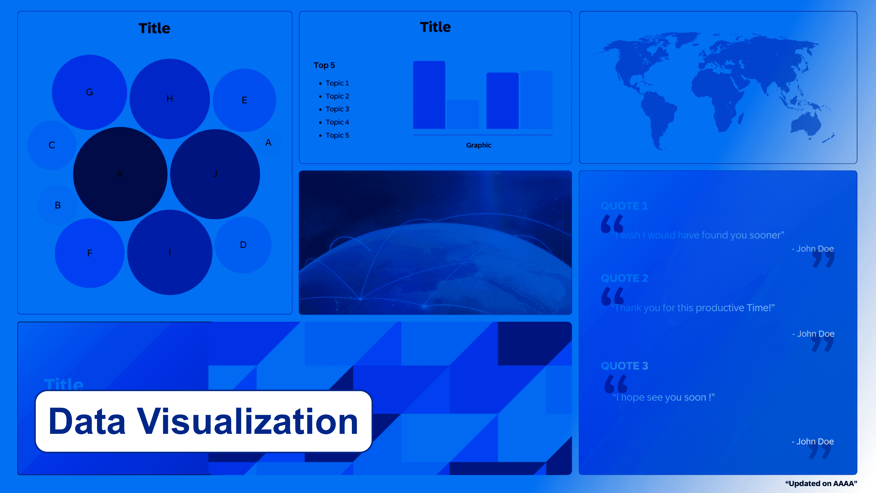
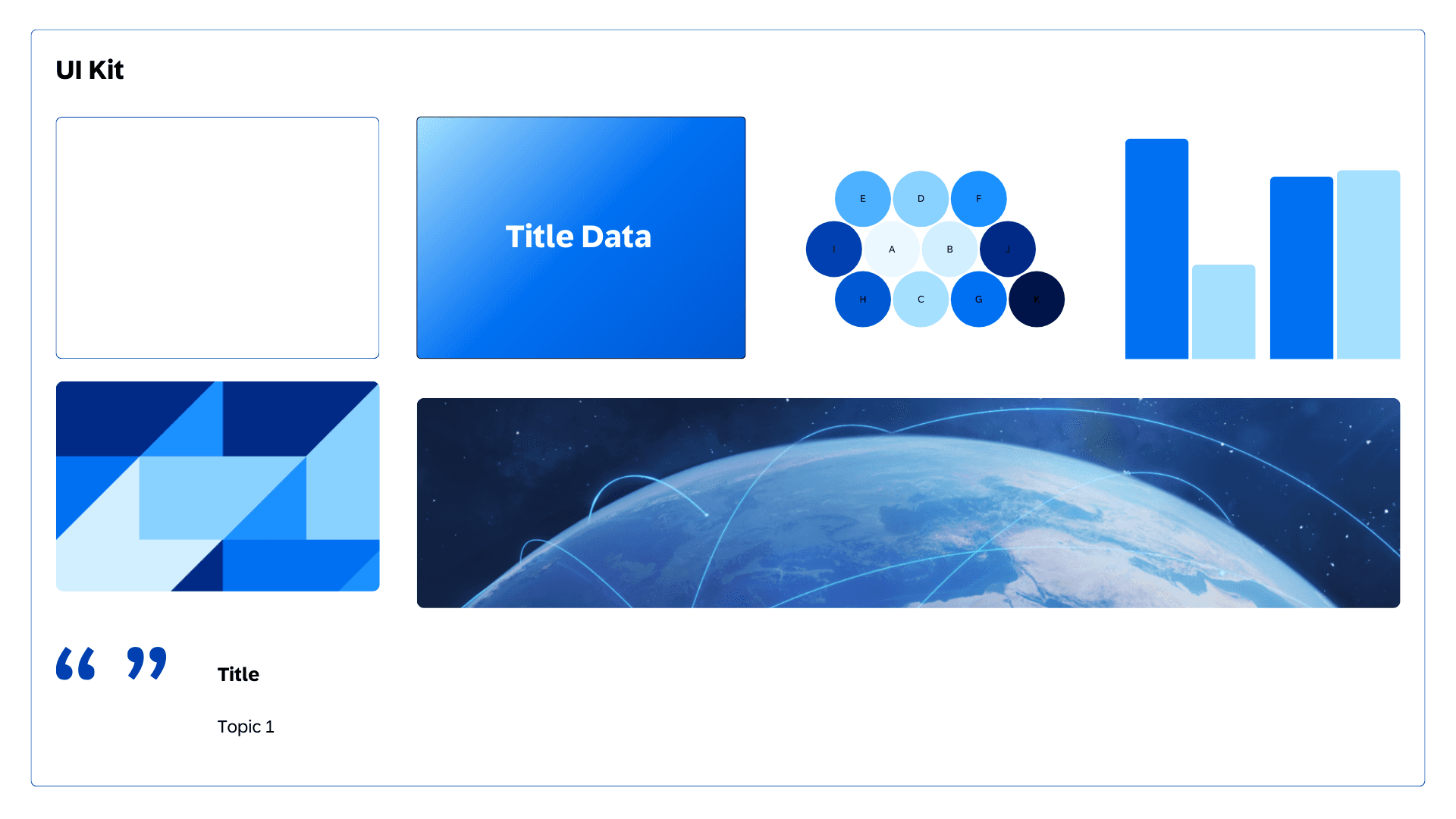
Dashboard components
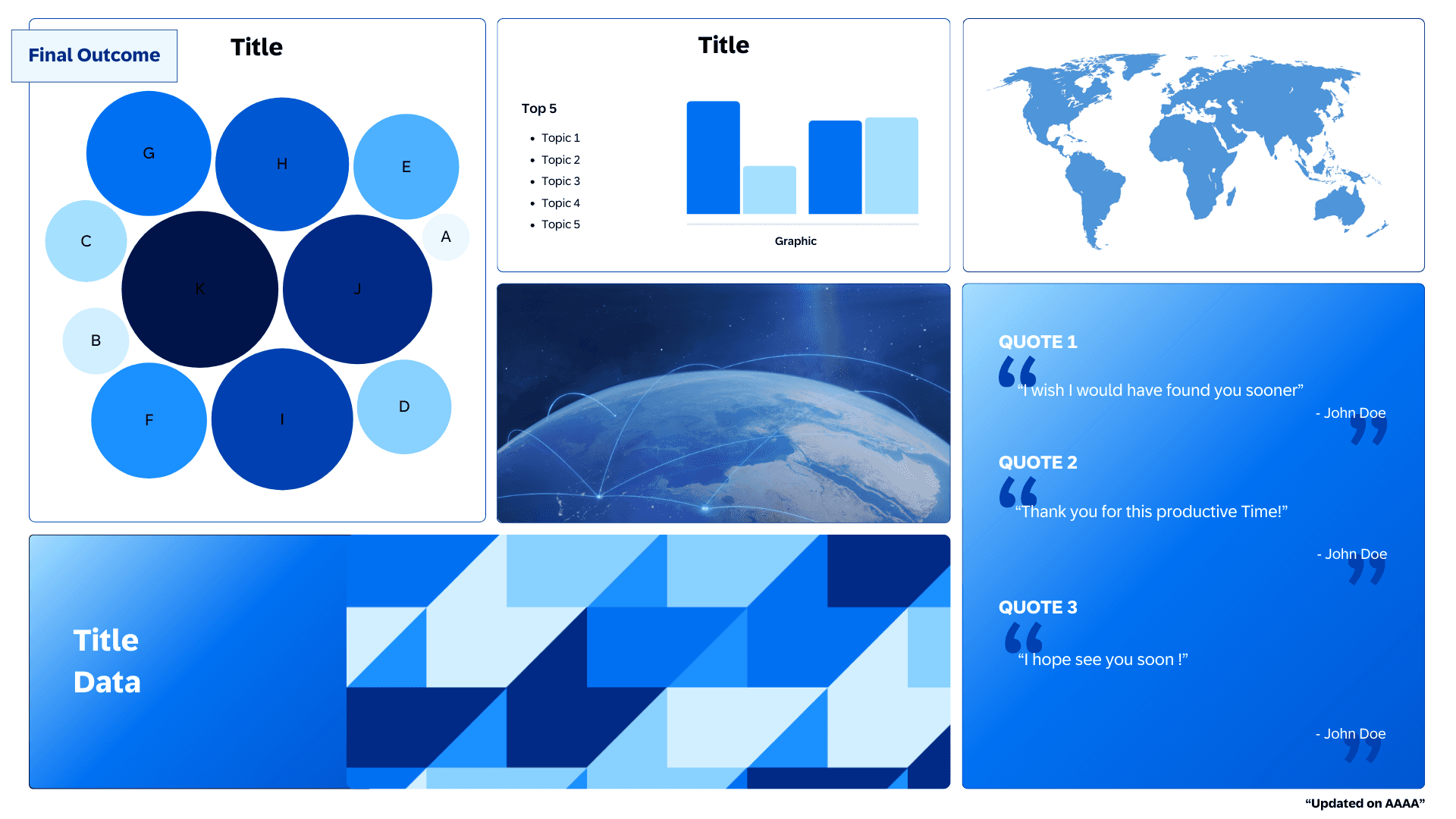
Dashboard visual
Learnings
The relationship between data and the UX allows us to know in detail the scope of the users. Visualising data allows for a quick and effective way of communicating information in a universal way using only visual information. If we take it to the field of UX design, it can help a lot in building storytellings, provide a global vision to the team, identify problems, make decisions, communicate the facts...
See here the site